Unlocking the Secrets of Potential Energy Diagrams
Ever wondered how scientists predict the outcome of chemical reactions or understand the dynamics of physical processes? One powerful tool they employ is the potential energy diagram, a visual representation that unveils the energetic landscape of these transformations. Think of it as a roadmap for energy changes, guiding us through the intricate dance of molecules and forces.
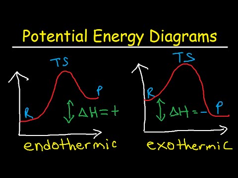
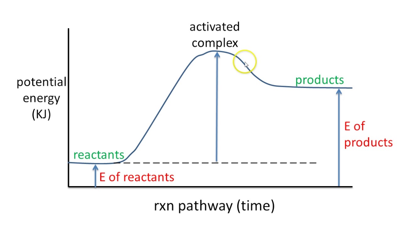
A potential energy diagram, complete with clear labels, illustrates the change in potential energy of a system as it progresses from reactants to products. The vertical axis represents potential energy, while the horizontal axis depicts the reaction coordinate, which represents the progress of the reaction or process. These diagrams are more than just static pictures; they are dynamic narratives that tell the story of energy flow.
The concept of potential energy diagrams emerged from the development of thermodynamics and chemical kinetics in the late 19th and early 20th centuries. Scientists like Svante Arrhenius and Jacobus Henricus van 't Hoff laid the groundwork for understanding reaction rates and energy barriers, paving the way for visualizing these concepts through diagrams. These diagrams are now indispensable tools in chemistry, physics, and related fields.
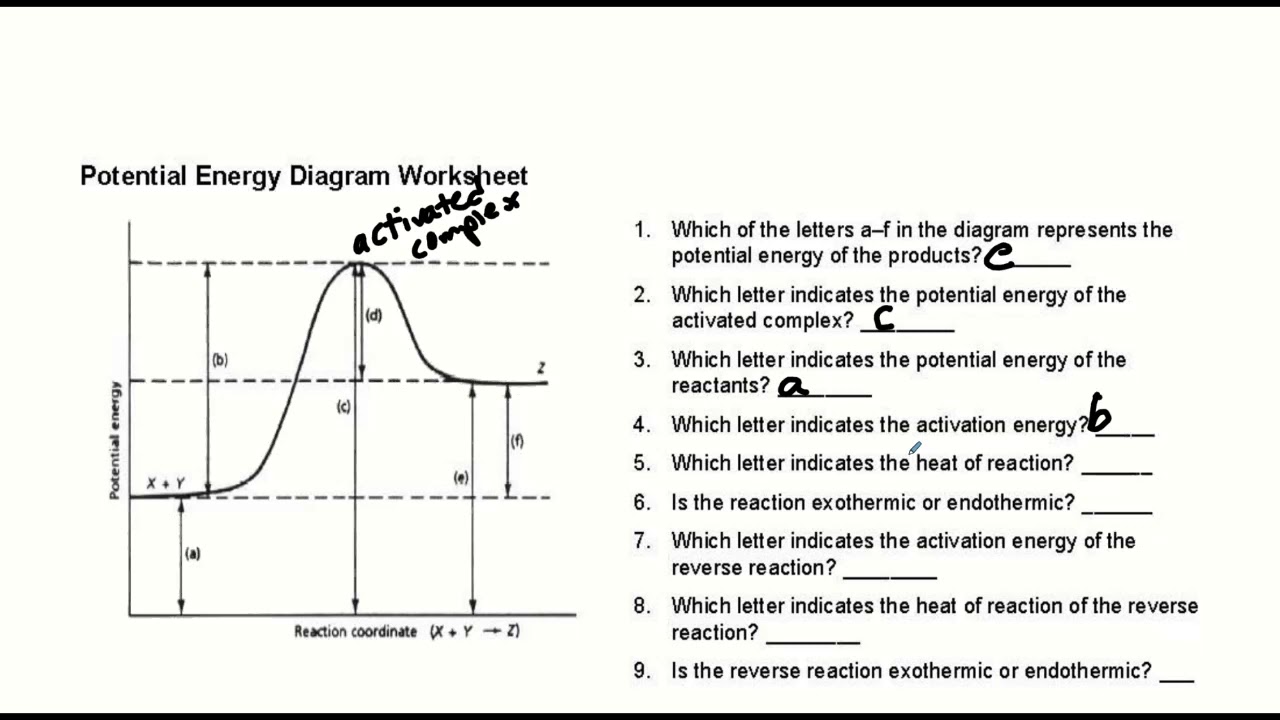
A key feature of these diagrams is the activation energy, represented by the peak or "hill" on the curve. This energy barrier is the minimum amount of energy required for the reactants to transform into products. A labeled diagram clearly identifies this critical energy threshold, offering insights into the speed and feasibility of a reaction. A high activation energy signifies a slow reaction, while a low activation energy implies a faster reaction. The difference in potential energy between reactants and products represents the overall energy change of the reaction.
Understanding a potential energy diagram with labels is crucial for comprehending reaction mechanisms and predicting reaction outcomes. It allows scientists to determine whether a reaction is exothermic (releases energy) or endothermic (absorbs energy), providing essential information for controlling and optimizing chemical processes. Moreover, the diagram can reveal the presence of intermediates, which are temporary species formed during the reaction pathway.
One simple example is the combustion of methane. The potential energy diagram for this reaction shows a high initial energy for the reactants (methane and oxygen) and a lower final energy for the products (carbon dioxide and water), indicating an exothermic reaction. The diagram also reveals the activation energy required to initiate the combustion process.
Benefits of using labeled potential energy diagrams include: 1) Visualizing energy changes, 2) Understanding reaction mechanisms, and 3) Predicting reaction outcomes.
Creating a potential energy diagram involves plotting the potential energy against the reaction coordinate. Label the axes, the reactants, products, activation energy, and any intermediates. Software tools and online resources can assist in creating these diagrams.
Advantages and Disadvantages of Potential Energy Diagrams
| Advantages | Disadvantages |
|---|---|
| Visual representation of energy changes | Simplification of complex reactions |
| Insight into reaction mechanisms | Limited information on reaction rates |
| Prediction of reaction outcomes | Can be challenging to construct for complex systems |
Best Practices: 1. Clearly label all axes and key points on the diagram. 2. Use appropriate units for energy and the reaction coordinate. 3. Ensure the diagram accurately reflects the reaction mechanism. 4. Choose a suitable scale for the axes to clearly display the energy changes. 5. Compare and contrast diagrams for different reactions.
FAQ: 1. What does the peak of the diagram represent? (Activation energy) 2. What does the difference in energy between reactants and products indicate? (Overall energy change) 3. What is the reaction coordinate? (Progress of the reaction) 4. What does a negative energy change signify? (Exothermic reaction) 5. What does a positive energy change signify? (Endothermic reaction) 6. How does a catalyst affect the diagram? (Lowers activation energy) 7. Can a diagram have multiple peaks? (Yes, for multi-step reactions) 8. How are intermediates represented on the diagram? (Local minima between reactants and products)
In conclusion, potential energy diagrams with labels are invaluable tools for understanding the energetics of chemical reactions and physical processes. They provide a visual roadmap of energy changes, revealing key information about activation energy, reaction mechanisms, and reaction outcomes. From predicting the feasibility of a reaction to understanding the role of catalysts, these diagrams empower scientists and students alike to unlock the secrets of the molecular world. By mastering the art of interpreting and constructing these diagrams, we gain a deeper appreciation for the dynamic interplay of energy and matter that shapes our universe. Exploring these concepts further through textbooks, online simulations, and educational software can enhance your understanding and open doors to a richer appreciation of the sciences.
Decoding bolt sizes your imperial to metric conversion guide
Unlock creativity with polaroid frame templates psd powerhouse
Unraveling the s class i raised chapter 135


