Mastering the Cursive Lowercase R: A Comprehensive Guide
The elegant dance of pen on paper, forming letters that flow seamlessly together – that's the allure of cursive writing. But among the loops and swirls, one letter often trips up even seasoned penmanship enthusiasts: the lowercase cursive 'r'. This seemingly simple character can morph into a confusing scribble if not executed correctly. So, how does one conquer this cursive conundrum?
Mastering the cursive lowercase 'r' might seem like a minor detail, but it's a key component of legible and aesthetically pleasing cursive handwriting. This guide delves into the nuances of forming this often-misunderstood letter, providing a comprehensive roadmap to cursive 'r' mastery. From its historical origins to practical tips and troubleshooting, we'll explore everything you need to know to confidently craft this crucial character.
The cursive lowercase 'r' shares a lineage with its print counterpart, ultimately tracing back to the Roman alphabet. Its cursive form evolved over centuries, influenced by various writing styles and the need for speed and efficiency. Understanding this evolution gives us context and appreciation for the seemingly arbitrary curves and strokes that define its modern form. One of the main issues encountered when learning the cursive 'r' is its similarity to other cursive letters like 'n' and 'v'. Differentiating these characters requires careful attention to the initial stroke and the subsequent upward curve.
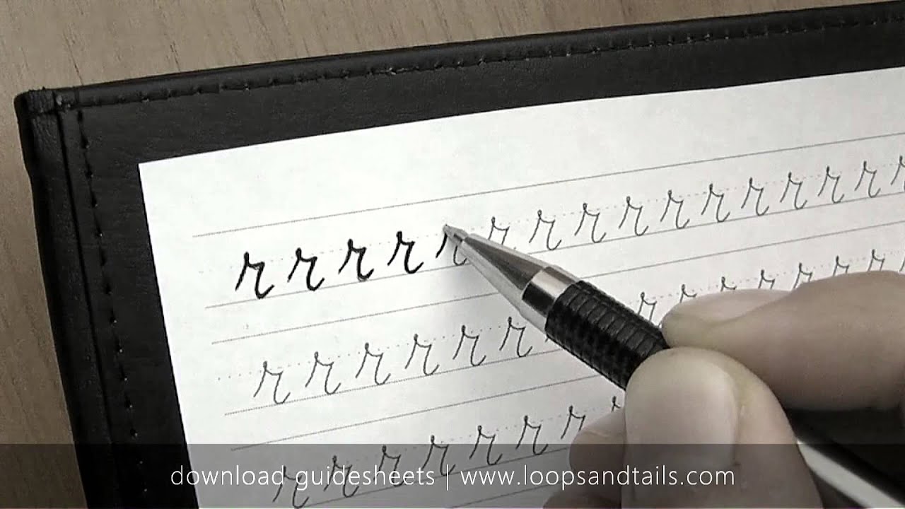
To form the cursive lowercase 'r', begin with a small upward stroke, similar to the start of a cursive 'i'. Curve this stroke slightly to the right, then bring the pen down in a short, slightly curved stroke, resembling a miniature 'u'. Finally, extend the pen upward in a smooth curve, connecting to the next letter. This creates a fluid, almost wave-like motion.
A common mistake is making the initial upstroke too tall or the downward stroke too straight, which can make the 'r' look like an 'i' or 'n'. Practice is essential to achieve the correct proportions and flow. Try writing the 'r' repeatedly in combination with other letters to develop a natural rhythm and consistent form.
Now, let's dive into the benefits of mastering this cursive character. Firstly, a well-formed cursive 'r' enhances the overall legibility of your writing. This is crucial for clear communication, whether you're jotting down notes, writing a letter, or signing important documents. Secondly, it adds a touch of elegance and sophistication to your handwriting. Finally, the process of learning and perfecting the cursive 'r' strengthens fine motor skills and improves hand-eye coordination.
Advantages and Disadvantages of Focusing on the Cursive Lowercase 'r'
| Advantages | Disadvantages |
|---|---|
| Improved legibility | Can be time-consuming to master |
| Enhanced handwriting aesthetics | May not be relevant for all writing tasks (e.g., typing) |
| Improved fine motor skills |
Here's a step-by-step guide for perfecting your cursive 'r': Start with the initial upstroke, curving slightly to the right. Bring the pen down in a short, slightly curved stroke. Extend the pen upward in a smooth curve. Practice connecting the 'r' to other letters. Review your work and identify areas for improvement.
Frequently Asked Questions:
1. Why is the cursive 'r' so difficult? Answer: Its similarity to other cursive letters can make it tricky to master.
2. How can I practice effectively? Answer: Repetition and focusing on the correct stroke order are key.
3. Are there any online resources for cursive practice? Answer: Yes, many websites offer printable worksheets and tutorials.
4. Is cursive still relevant today? Answer: While typing is prevalent, cursive remains valuable for personal expression and certain documents.
5. How long does it take to learn cursive? Answer: It varies, but consistent practice leads to improvement over time.
6. What are some common mistakes to avoid? Answer: Making the initial upstroke too tall or the downward stroke too straight.
7. Can I learn cursive as an adult? Answer: Absolutely! It's never too late to learn a new skill.
8. How can I make my cursive 'r' look more fluid? Answer: Focus on connecting the strokes smoothly and maintaining a consistent rhythm.
Tips and tricks: Use lined paper to maintain consistent letter height. Practice writing words and sentences containing the 'r'. Visualize the shape of the letter before writing. Experiment with different pen angles and grips. Don't be afraid to make mistakes – they're part of the learning process.
In conclusion, the journey to mastering the cursive lowercase 'r' might require patience and dedication, but the rewards are significant. From improved legibility and enhanced handwriting aesthetics to better fine motor skills, perfecting this often-overlooked character unlocks a world of cursive fluency. By following the steps outlined in this guide, practicing regularly, and embracing the nuances of this elegant letterform, you can elevate your cursive writing to new levels of clarity and style. Embrace the challenge, pick up your pen, and begin your journey towards cursive 'r' mastery today. The ability to write in cursive provides a unique personal touch in a digital world, allowing for personalized notes, letters, and journal entries. Continue practicing and exploring the beauty of cursive writing.
Unveiling the seaside kingdom painting mystery
The male leads adopted daughter phenomenon
Unlocking the past a journey with the old english dictionary


