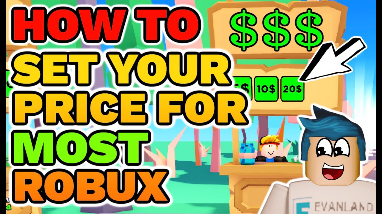
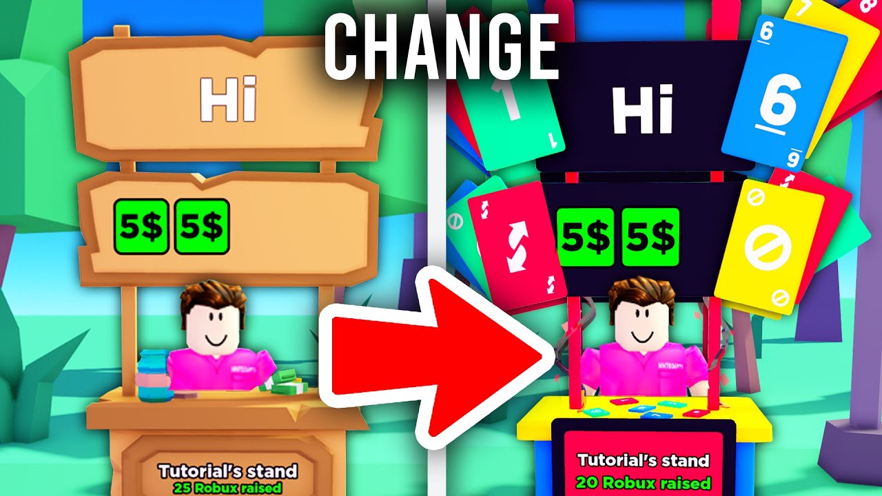
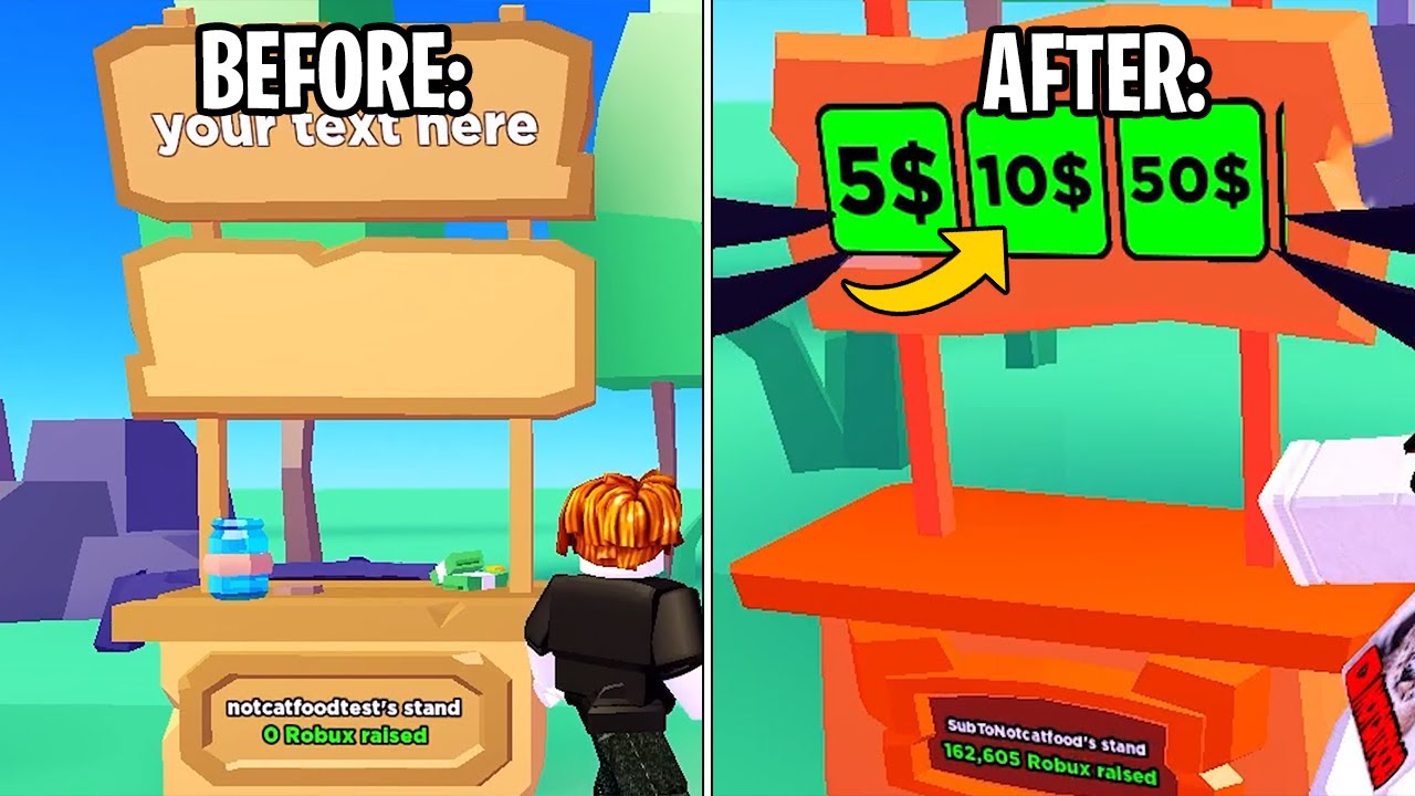
Level Up Your Livestream: Crafting the Perfect Donation Stand
Let's be honest, in the vast digital landscape of livestreaming, standing out is key. And while compelling content reigns supreme, a well-designed "donation stand" – that designated space where viewers can contribute – can truly elevate your stream. It's not just about asking for money; it's about cultivating a community and acknowledging their support in a visually engaging way. So, how do you create a donation setup that's not just functional, but also a stylish reflection of your brand?
Think of your donation setup as an extension of your on-screen persona. It's a subtle yet powerful way to communicate your aesthetic, your values, and your gratitude towards your supporters. A bland, generic donation button simply won't cut it. We're talking about a curated experience – a visual feast that complements your content and entices viewers to click that "donate" button.
The quest for the ultimate donation stand isn't a new phenomenon. From the early days of online content creation, creators have been experimenting with different approaches to solicit donations. Initially, it might have been a simple PayPal link tucked away in a video description. But as livestreaming platforms evolved, so too did the methods of requesting support. Overlay alerts, animated thank-you messages, and customized donation goals became the norm. Now, the focus has shifted towards seamlessly integrating the donation aspect into the overall stream aesthetic.
One of the biggest challenges creators face is striking the right balance between promoting donations and maintaining the flow of their content. No one wants to feel like they're being bombarded with constant pleas for money. The key is to integrate the donation stand organically, making it a natural part of the viewing experience rather than an intrusive interruption. This requires careful consideration of placement, design, and the overall tone of your communication.
So, what exactly makes a "cool" donation stand? It's more than just flashing lights and catchy animations (though those can certainly help!). It's about creating a cohesive visual that aligns with your brand identity and resonates with your audience. Think about your color palette, your typography, and the overall mood you want to convey. Is it playful and energetic? Sophisticated and minimalist? The possibilities are endless.
Benefits of a cool donation stand include increased viewer engagement, higher donation amounts, and strengthened community ties.
Example: Incorporating quirky animations for each donation tier can be more engaging than a static display.
Action Plan: Define your brand aesthetic, design your stand, choose your platform integration, and promote it on stream.
Advantages and Disadvantages of Emphasizing Donations
| Advantages | Disadvantages |
|---|---|
| Funds content creation | Can appear greedy |
| Shows appreciation to supporters | Might alienate viewers |
| Builds community | Pressure to deliver more content |
Best Practices: 1. Clear call to action. 2. Visually appealing design. 3. Tiered donation rewards. 4. Regular shoutouts. 5. Thank-you messages.
FAQ: 1. What platforms support donation stands? 2. How do I set up donation alerts? 3. Can I customize my thank-you messages? 4. What are some creative donation incentives? 5. How often should I promote my donation stand? 6. Are there any legal considerations for accepting donations? 7. How can I track my donation progress? 8. What are some common mistakes to avoid?
Tips and Tricks: Use high-quality graphics, experiment with different animation styles, personalize your thank-you messages, and offer unique incentives for different donation levels.
In conclusion, crafting a cool donation stand is more than just a fundraising tactic; it's an opportunity to build a stronger connection with your audience. By thoughtfully designing a visually appealing and engaging donation experience, you can not only support your content creation but also foster a sense of community and shared appreciation. Remember, the key is to be authentic, creative, and genuinely grateful for the support you receive. So, go forth and create a donation stand that truly reflects your unique brand and captivates your viewers. Don't be afraid to experiment, try new things, and most importantly, have fun with it!
Grade 88 bolt torque specifications
Navigating grief chicago style galewood funeral home options
Unlocking the potential of ea fc 24 real madrid


